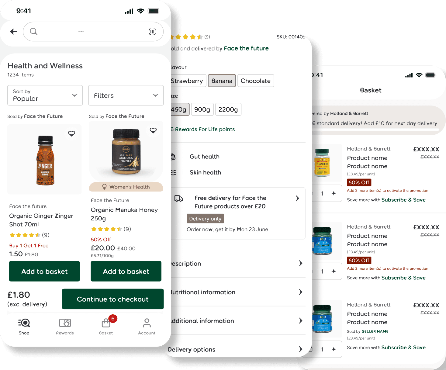
H&B Marketplace and Delivery by Seller (DBS)
Expanded Selection: Enable partners to ship directly to customers, significantly increasing product variety without the need for internal inventory.
Brand Consistency: Maintain the trusted H&B experience by ensuring partner fulfillment meets our established standards for reliability and quality.
The challenge
Holland & Barrett’s transition from a single-retailer to a Marketplace model significantly expanded the product range but created three critical UX friction points:
Delivery Fragmentation: Inconsistent fees and shipping speeds within a single order.
Journey Complexity: Introducing third-party sellers added significant layers of complexity to standard, well-established user journeys.
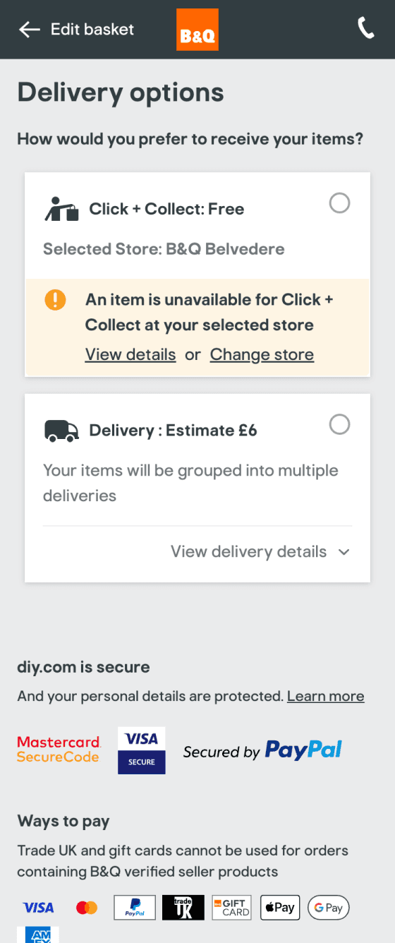
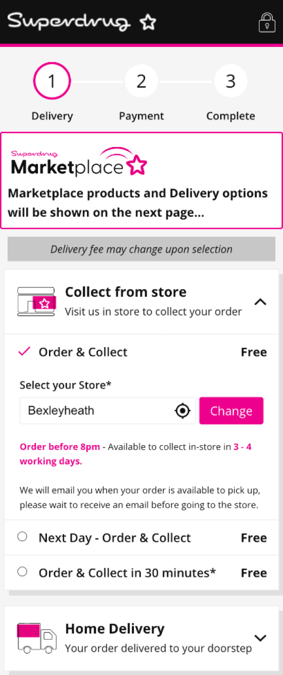
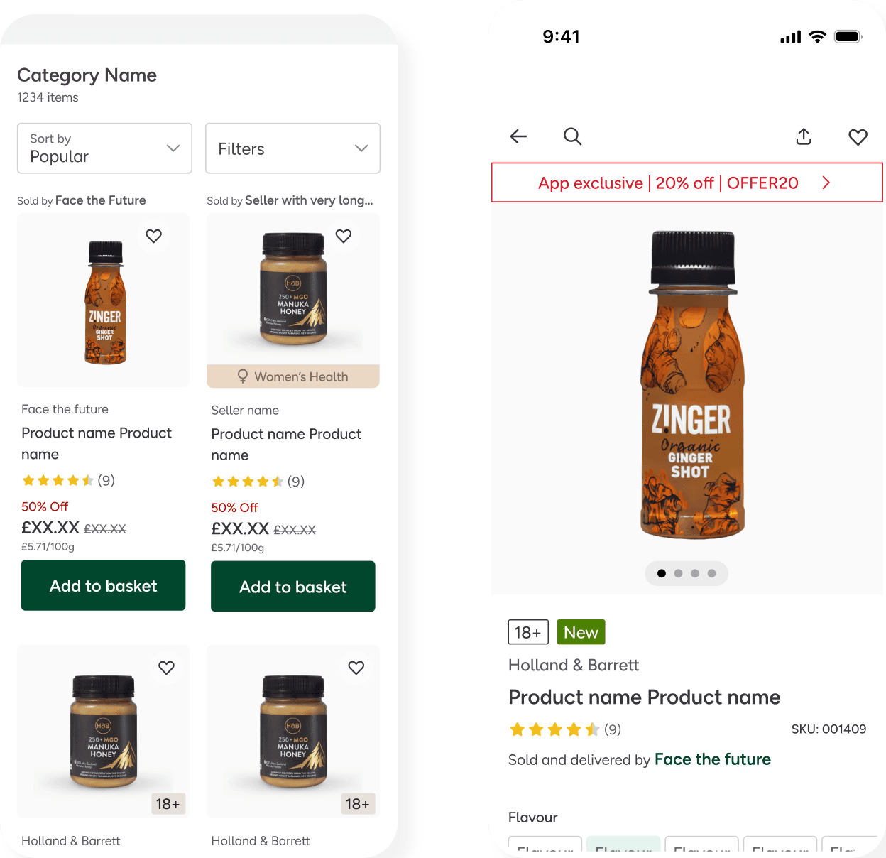
Fulfillment Limits: Third-party items did not support the popular Click & Collect service.
The Goal: Introduce marketplace sellers while protecting the "H&B Trust"—ensuring users are never surprised by split deliveries or hidden costs at the final stage of checkout.
Role:
Lead Product Designer (End-to-End)
Platform:
Responsive Web, iOS, & Android
Collaborators:
Search, PDP, P13n, Basket/Checkout, and Customer squads
Tools:
Figma, UXTweak, AI Tools
Status:
Live
User-Centric Validation
Testing and Validation
I partnered with a UX Researcher to conduct moderated usability testing (6 participants) using:
Low-fi wireframes to validate core logic.
Competitive audits to benchmark established marketplace patterns.
The Reality Check
The "seamless" approach we envisioned hit two major roadblocks:
Ignored Badging: Users completely overlooked marketplace identifiers.
Cognitive Overload: The streamlined flow overwhelmed users at the final stages.
3 Key Insights from Testing
Brand Blindness: Users didn't realise they were in a marketplace until they hit "split fulfilment" at checkout.
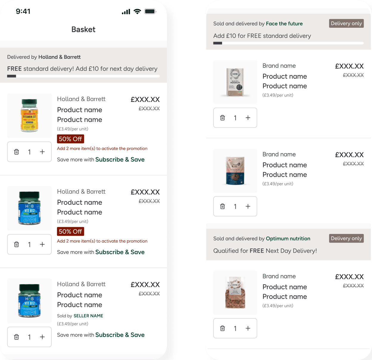
The Delivery Trap: Users expected a £25 free delivery threshold for the entire basket, not per seller.
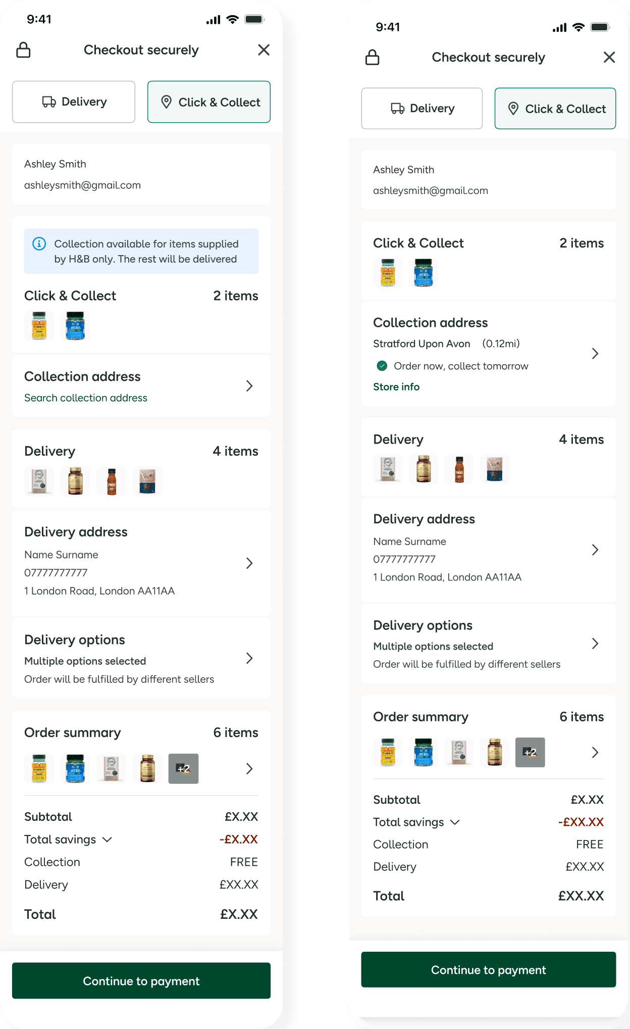
The Journey Wall: Users got stuck at checkout, unable to distinguish between "collection" and "delivery" details for different items.

The Solution
Phase 1: Creating a Visual Language (Clarity & Consistency)
I started by designing a Universal Badge System.
The Struggle: Initial designs used heavy icons that cluttered the UI on mobile.
The Pivot: I moved toward a subtle but distinct text-based "Sold & Delivered by [Seller]" tag. This met accessibility standards without distracting from the product imagery.
Phase 2: Solving the Basket Complexity
The most complex area was the Basket & Checkout. When a user has an H&B item (Click & Collect) and a Seller item (Home Delivery), the UI often breaks.
Decision: I implemented a Grouped Seller Logic. Items are visually boxed by the fulfiller.
Reasoning: This allows the user to see exactly why they are paying two different delivery fees. It turns a "hidden cost" into a "logical consequence" of their choice.
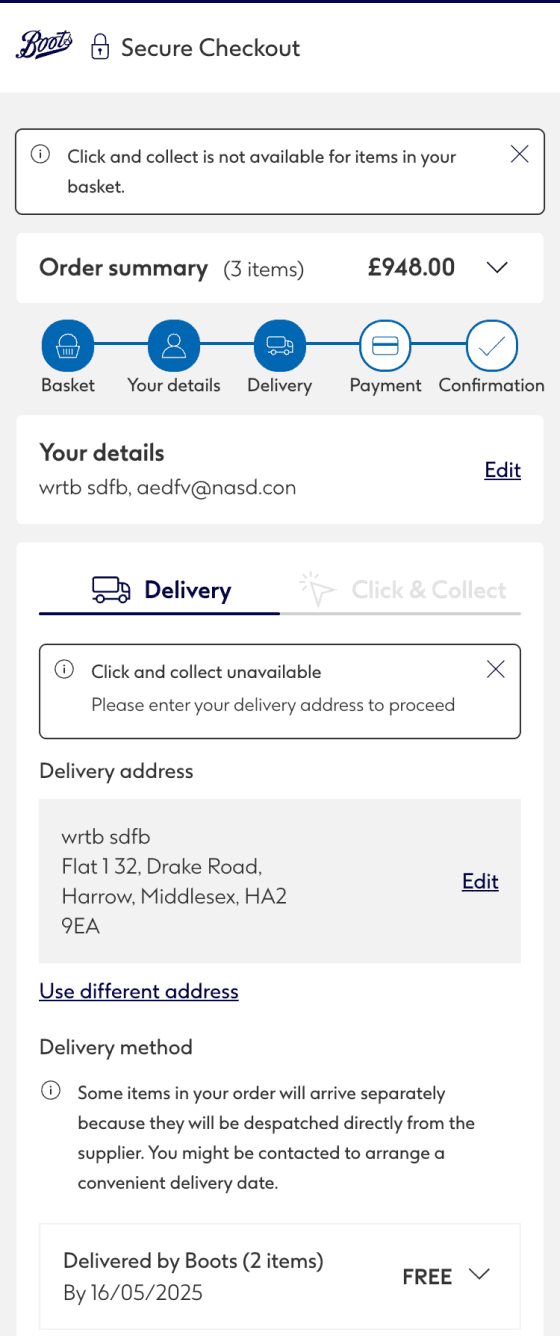
Phase3: The "Mixed Checkout"
Managing a single transaction containing both Click & Collect (H&B) and Home Delivery (Marketplace) items.
The Logic Gap: Traditional flows are linear; I had to design a "Multi-Stream" journey that felt unified despite using two different engines.
The Technical Hurdle: Legacy backend systems couldn't split orders at the UI level. I had to bridge this gap with an intuitive interface.
The Solution: Sequential Fulfillment
I introduced a staged flow to simplify the mental model:
Step 1: Confirm H&B collection point.
Step 2: "Unlock" the Seller’s shipping address section.
This created a seamless hybrid experience while maintaining technical separation between fulfillment streams.
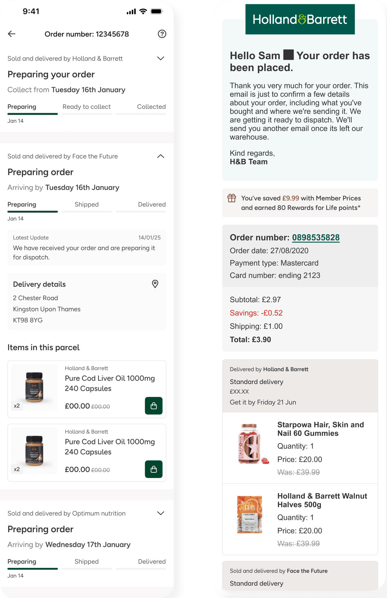
Phase 4: Post-Purchase Trust
Once the order is placed, the "H&B Brand Promise" is at its most vulnerable. If a user receives one item but not the other, they may think the order is lost.
The overview: I restructured the Order History and Confirmation Emails to move away from a "Simple List" of products.
The “grouped orders” Logic: I implemented a hierarchy where the page is organised by order status, using accordions to disclose the important information, while keeping the screen clean.
PACKAGE 1 (H&B): "Ready for Collection at [Store Name]".
PACKAGE 2 (Seller): "Dispatched - Track with [Carrier]" for the Marketplace item.
Outcomes and Evolution
Collaborative impact and Reflections
As the Lead Designer, I acted as the "connective tissue" between several product squads (Search, PDP, P13n, and Checkout), each with competing KPIs. While the Search squad prioritized page load speeds, the Checkout squad focused strictly on conversion. To align these teams under a unified vision, I facilitated a series of cross-squad workshops and frequent stakeholder reviews. Navigating this was a high-pressure challenge, as I had to balance tight delivery deadlines with rigid technical constraints while ensuring the user experience was functional and beautiful.
Outcomes and lessons learned
Commercial Growth: The platform generated £1.16M GMV in the last financial year and has already scaled to £3.1M in the current fiscal year.
Inventory Expansion: We successfully launched 1,845 SKUs and onboarded 100+ live sellers, with a pipeline of over 400 more.
What I’d do differently: If I were to revisit this phase, I would have pushed for an even quicker checkout process to further reduce the friction of split fulfillment. I would also have improved the stakeholder review process by establishing more frequent, smaller touchpoints to navigate the complex cross-squad dependencies more efficiently under tight deadlines.